Chapter 4 Results
4.1 Exploratory data analysis
This first part focuses on the dataset itself and the relationship between different features. The main focus is set on the number of unclassified sequencing reads. These are the sequencing reads which could not be assigned to any class by comparing them to a set of known reference sequences using VirMet. All sequencing reads which did not pass the quality filtering steps of VirMet are always excluded since they are neither classified nor unclassified as no attempt was made to classify them.
4.1.1 Hypothesis
Based on experience, we hypothesized that the number of unclassified reads depends on the number of reads sequenced.
If we sequence more, we also expect to observe more reads which cannot be classified. This relationship is likely not strictly linear as it was observed previously that for samples with a low number of sequencing reads, a disproportionate number of reads could not be classified. This might be caused by the lower sequencing performance due to little DNA or RNA starting material.
These observations led to the hypothesis that the number of unclassified reads would follow the black curve drawn in Figure 4.1. If it would be possible to model this curve of the expected relation it could serve as a way to automatically flag potentially interesting samples (blue circles in Figure 4.1) by just using the number of quality-filtered and unclassified reads. These two numbers are available for each sample that was analyzed using VirMet and no additional tool would be needed to generate additional information.
The potentially interesting samples probably contain large numbers of sequencing reads from organisms that are not part of the reference databases used and it might be worth carrying out further investigations on them.
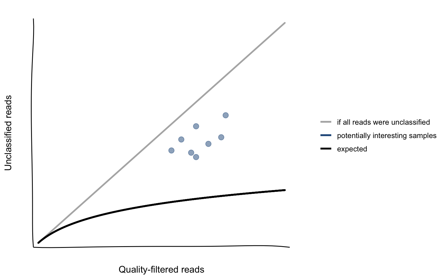
Figure 4.1: Hypothetical relationship between the number of unclassified reads and the number of quality-filtered reads.
4.1.2 Using linear regression to flag potentially interesting samples
The association which was hypothesized in Section 4.1.1 is supported with the actual data in Figure 4.2. While it has already been shown (Figure 3.1) that the total number of reads from the DNA workflow is higher compared to the RNA workflow, it can now be seen that the variability of unclassified reads is also higher in DNA samples.
The relationship looks similar to what we expected (Figure 4.1).
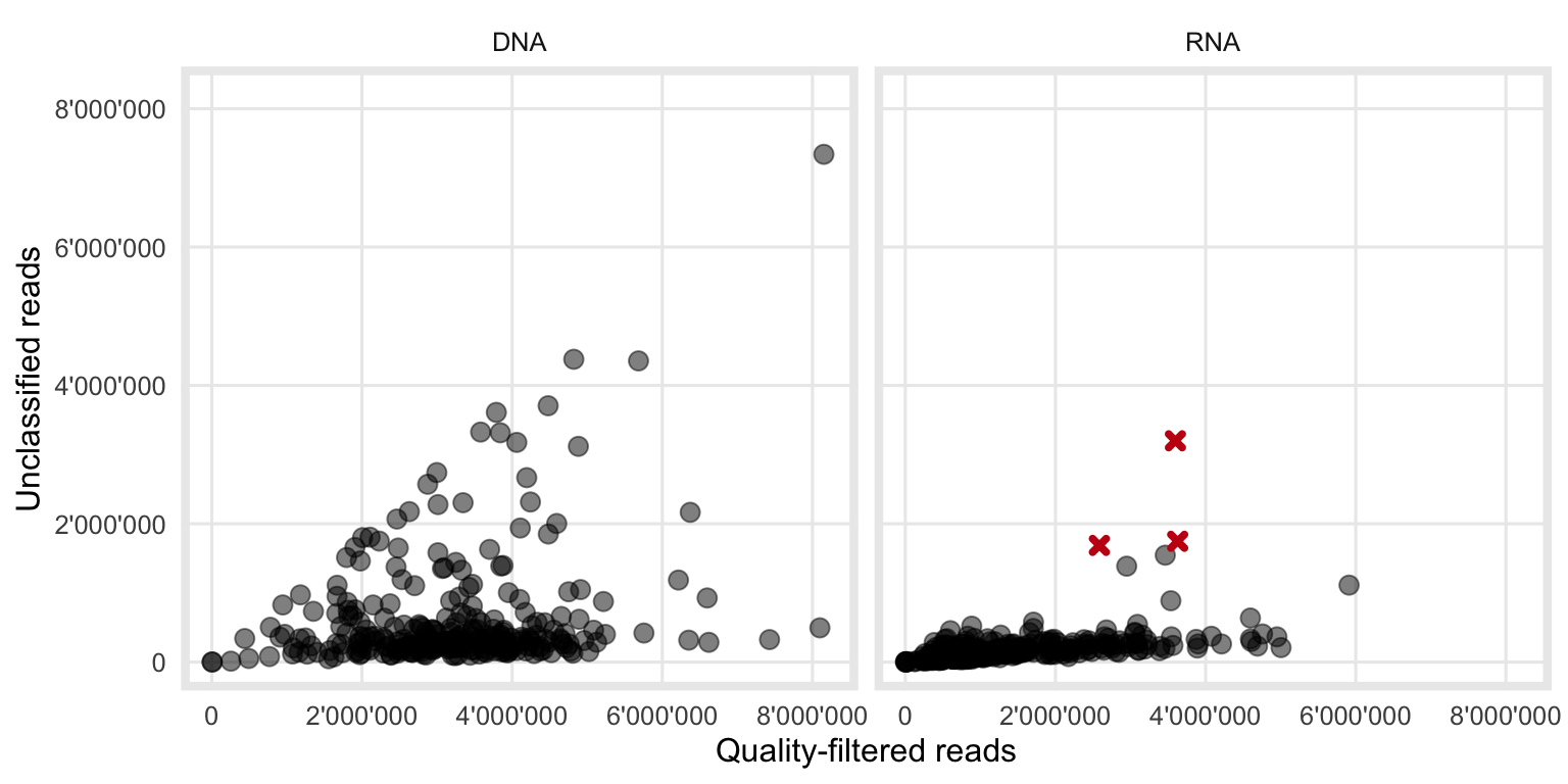
Figure 4.2: Observed relationship between the number of quality filtered- and unclassified-reads. The three red crosses are samples where the bacterial classification during VirMet failed. Those samples therefore show a higher than expected number of unclassified reads and were excluded from the further analysis to not distort any results.
To keep the model as simple and interpretable as possible, a linear regression was fitted to the combined (DNA and RNA) data.
Fitting the linear regression was done in two steps, first using all data and then a second time using only datapoints with the residual from the first regression smaller than the predefined threshold of 500’000 reads. The reason for this was to reduce the effect of influential outliers.
Figure 4.3 shows the result and summarizes the method of how potentially interesting samples are flagged.
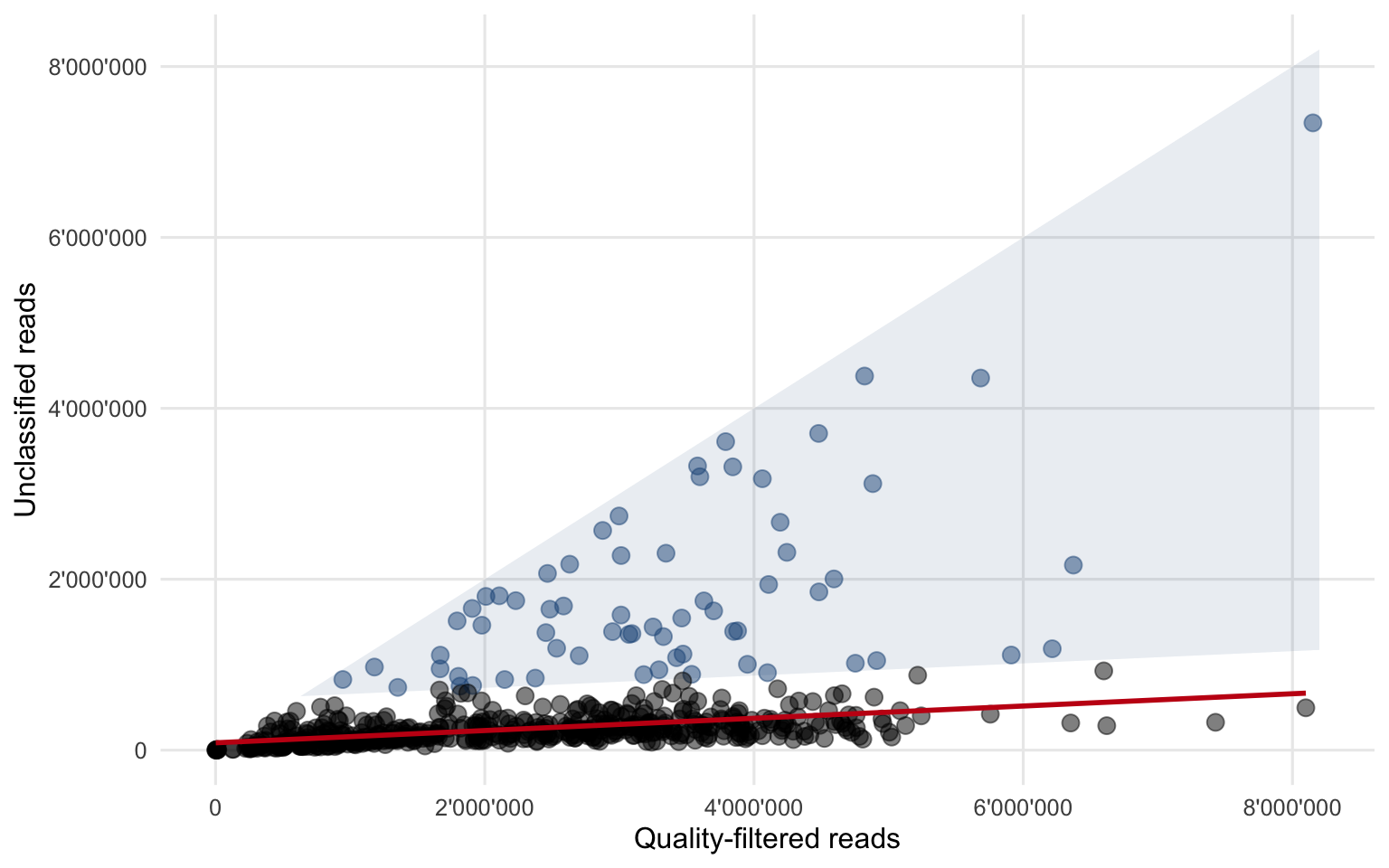
Figure 4.3: All data points combined and the fitted second linear regression (red line). A residual of 500’000 reads in the second regression was used as the threshold to flag potentially interesting samples (blue circles within the shaded area).
The final linear regression equation (4.1) can be interpreted as follows:
- The slope of 0.072 stands for the fraction of sequenced, quality-filtered reads which remain unclassified. If for example we have 1000 quality-filtered reads more, we would expect to observe 72 additional unclassified reads. This part of the equation is responsible for a constant increase of unclassified reads when there are more quality-filtered reads.
- The intercept of 85’790 unclassified reads stands for the fixed amount of background “noise”, i.e. the number of sequencing reads which cannot be classified and does not change with an increasing number of sequenced reads.
A sample is then flagged as interesting if the equation (4.2) holds true. This can be interpreted as follows:
- If a sample contains 500’000 unclassified reads more than what is expected (red regression line in Figure 4.3), it falls within the blue shaded area and is flagged.
There is however an important limitation to this method. The threshold for flagging samples had to be chosen relatively high (500’000 unclassified reads more than expected) to take the high variations into account. This means that there have to be at least that many reads of a novel organism (or an organism that was not present in the reference databases used to classify the sequencing reads) present for that sample to be flagged.
Figure 4.4 however shows, that of the detected and reported viruses within that dataset (excluding Bacteriophages) only two would have passed that threshold. This means that novel (respiratory) viruses would not be able to be picked up using this method unless the viral load was very high.
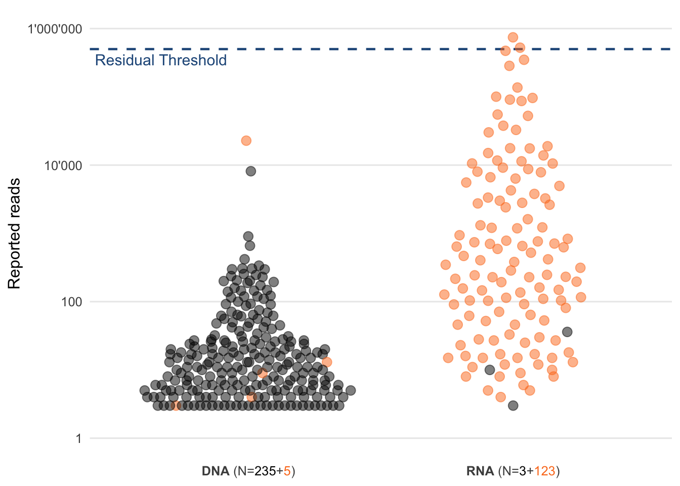
Figure 4.4: Distribution of the read counts of reported viruses. Each circle represents a virus that was reported to the physician. Highlighted in orange are respiratory viruses and the blue dashed line represents the chosen residual threshold of 500’000 reads.
4.1.3 Correlations between the classes
After having looked into detail at the relationship between the number of quality-filtered and unclassified reads in Section 4.1.2, this Section examines correlations between the proportions of different classes. The proportions rather than the absolute read numbers per class were chosen to better compare samples with different sequencing depths.
The Pearson correlation coefficients in Figure 4.5 highlight the direction and strength of the linear relationship between the different classes. One however has to note that (as the famous phrase goes):
Correlation does not imply causation.
Meaning even if we observe strong correlations between some classes, from that alone we are not able to draw conclusions of a cause-and-effect relationship. Further experiments would be needed to investigate this.
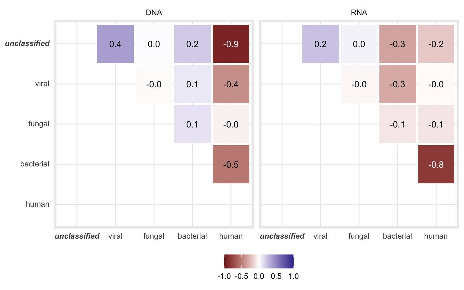
Figure 4.5: Pearson correlation coefficients when comparing the proportion of the different classes of each sample.
The correlation is the strongest between unclassified and human for DNA and between bacterial and human fractions for RNA samples. Both of these correlations are negative, meaning while the fraction of one class increases, the other decreases.
Figures 4.6 and 4.7 demonstrate these correlations in detail.
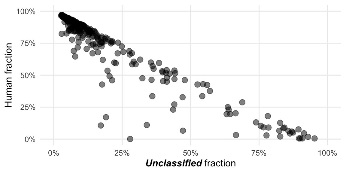
Figure 4.6: The strongest correlation among DNA samples is between the proportion of human- and unclassified-reads.
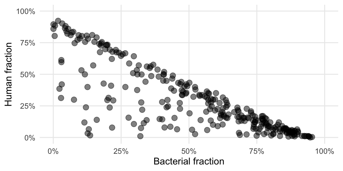
Figure 4.7: The strongest correlation among RNA samples is between the proportion of human- and bacterial-reads.
We see here a bit clearer what was already visible in the Figures 3.2 and 3.3. The reads of the DNA workflow are predominantly of either human or undetermined origin while for the RNA workflow it’s mainly either human or bacterial origin, with some exceptions.
4.2 Comparing quality
This Section focuses on the hypothesis that some reads end up being unclassified because their quality is lower or the read length is shorter when compared to the classified reads. This is because the shorter reads and those of lower quality contain less (useful) information which can be used to classify them.
The dataset for this section consists of all reads which have passed the quality filter steps of VirMet and distinguishes between classified (regardless of class) and unclassified reads.
4.2.1 Q30 rate
Using fastp15 the Q30 rate of each sample’s classified reads were compared to the unclassified reads of the same sample (Figure 4.8).
To test if the difference in this quality measure is significantly positive a Wilcoxon test (paired, one-sided) was performed. The p-value (\(p = 2\times 10^{-94}\)) of the test is less than the significance level \(\alpha = 0.05\). It can thus be concluded that the median Q30 rate of the classified reads is significantly greater compared to the median Q30 rate of the unclassified reads.
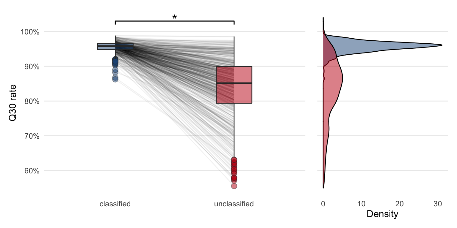
Figure 4.8: Comparing Q30 rates between the classified and unclassified reads reveals that the quality is higher in classified reads compared to unclassified reads. The lines between the boxplots are connecting Q30 rates from the same sample. The star indicates that the quality is significantly higher in classified reads based on the Wilcoxon test (paired, one-sided). The density plot shows the same data in a different way.
The observed lower median quality of the unclassified sequencing reads could partly explain why it was not possible to classify them. To verify that those reads were indeed not classified due to low quality and not the other way around (issue of cause and effect), simulation experiments would be required.
It must also be noted that a lower median quality does not imply that all unclassified reads of that sample are of lower quality. Some good quality reads might still be part of that unclassified fraction, which could not be classified for other reasons.
4.2.1.1 Comparing \(\Delta\)Q30 rate with residuals from the linear regression
Despite the fact that the median Q30 rate of the unclassified reads is lower, the lines which connect the boxplots in Figure 4.8 reveal that there are some samples with a smaller or no decrease in quality when compared to the classified reads.
Similar to what was hypothesized in Section 4.1.1 one could reason that these samples, where the quality of the unclassified reads remain relatively high compared to the classified ones, are likely the ones that contain sequencing reads from organisms that were not part of the reference databases used. These samples are therefore potentially interesting and it might be worth studying them in more detail.
\[\Delta\text{Q30 rate} = \text{Q30 rate of classified reads} - \text{Q30 rate of unclassified reads}\]
To compare this difference in Q30 rates (\(\Delta\)Q30 rate) with the previous method to flag samples, \(\Delta\)Q30 rate are plotted against the residuals from the linear regression. Figure 4.9 show a nonlinear dependence between these two variables. The samples with a lower \(\Delta\)Q30 rate generally feature a higher residual and were often flagged using the method described in Section 4.1.2.
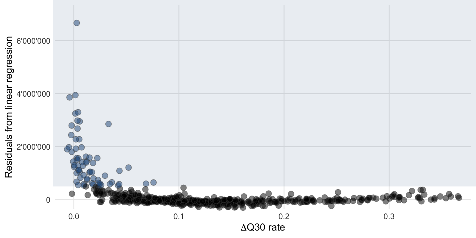
Figure 4.9: The flagged potentially interesting samples using the linear regression approach (blue circles) also tend to have a lower \(\Delta\)Q30 rate between the classified and unclassified reads.
This comparison indicates that these two (almost) independent methods come to a similar conclusion when it comes to flagging potentially interesting samples. However, there will always be some samples that are just at the boundary and will not be flagged because the transition is continuous and there are no two distinct clusters (normal versus potentially interesting) to separate.
The disadvantage of routinely implementing the \(\Delta\)Q30 rate method as opposed to (or in addition to) the linear regression method to flag samples is that the determination of Q30 rates for each sample would still need to be implemented since it is not part of the current VirMet workflow.
4.2.2 Read length
Analog to the Q30 rate, sequence read length of classified and unclassified reads were compared. As for the Q30 rate, a drop in mean read lengths can be seen in Figure 4.10. To test whether the differences are significant, the same type of Wilcoxon test (paired, one-sided) was performed. The p-value (\(p = 1.2\times 10^{-85}\)) of the test is less than the significance level \(\alpha = 0.05\). It can be concluded that the median mean read length of the classified reads is significantly greater compared to the unclassified reads.
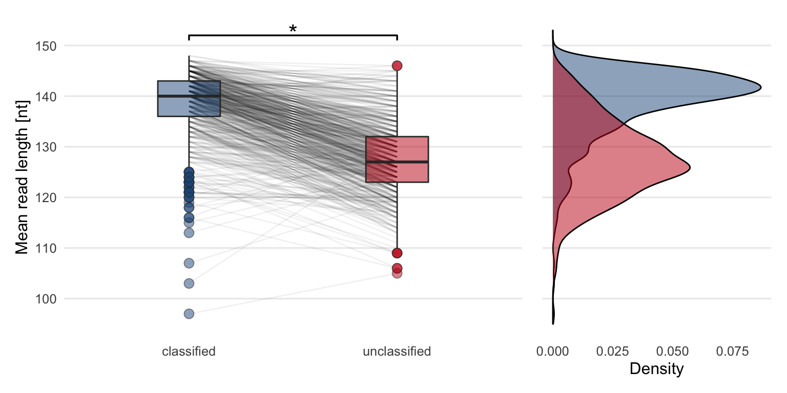
Figure 4.10: Comparing the mean sequence read lengths between classified and unclassified reads reveals that the classified reads are on average longer compared to unclassified reads. The lines between the boxplots are connecting mean read lengths from the same sample. The star indicates that the difference between the two groups is significant. The density plot shows the same data in a different way.
4.2.3 Adapter content
The next hypothesis was, that there might be leftover sequencing adapters present in the data which could lead to a read which cannot be classified. However, after scanning all quality-filtered sequencing reads for adapters there was no sign of a significant number of adapter sequences found that could explain at least a part of the unclassified fraction.
This can be seen as a good sign, as the automatic adapter trimming performed directly by Illumina’s sequencing software seems to work well.
4.2.4 GC-content
An additional measure that can be used to compare the classified and the unclassified reads is the GC-content, which is the proportion of bases being either Guanine or Cytosine. It is not directly clear how this measure relates to the quality of metagenome datasets, but it is nevertheless interesting to investigate it.
Since GC-content of the samples from the DNA and RNA workflows exhibit a different trend, they are shown in separate panels in Figure 4.11.
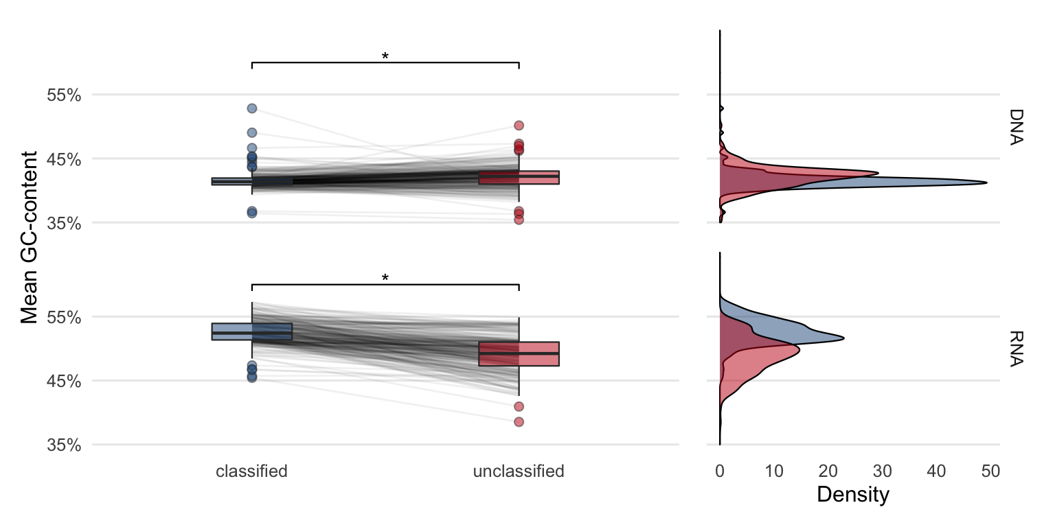
Figure 4.11: Comparing GC-content of the classified and unclassified reads reveals the differences between the groups. While in DNA samples the GC-content is higher in unclassified reads, the opposite is observed in RNA samples where the unclassified reads have a lower GC-content. The stars indicate that the difference between the groups is significant. The density plot shows the same data in a different way.
The Wilcoxon test (paired, two-sided) was performed separately for DNA and RNA samples. Both p-values (Table 4.1) are less than the significance level \(\alpha = 0.05\). It can be concluded that the median GC-content of the classified reads is significantly different compared to the unclassified reads in both DNA and RNA samples.
| workflow | p-value |
|---|---|
| DNA | 3.9e-12 |
| RNA | 7.2e-47 |
These differences might be explained by a biological factor and are presumably not associated with the quality of the samples.
4.3 Semi-supervised approach
4.3.1 Metagenome assembly
Metagenome assembly as described in step 2 in Figure 3.4 creates longer contigs from the short sequencing reads, which can carry more information. These are therefore more interesting when it comes to further analysis such as gene prediction or codon usage. Each sample and the two workflows (DNA and RNA) were processed separately to create a set of contigs using the metagenome assembler Megahit24 with its default parameters.
Figure 4.12 shows the distribution of the number of contigs formed of each sample.
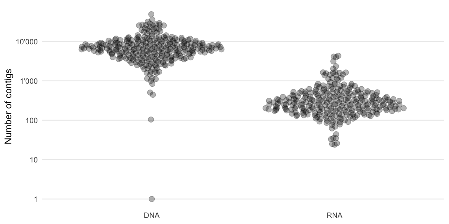
Figure 4.12: Distribution of the number of contigs built per sample using Megahit.
One would expect a large number of contigs as the microbial diversity within the environment (throat) can be large. But because the sequencing depth was not high enough to reconstruct whole genome sequences of all (or the majority) of these organisms, multiple contigs from the same species were likely formed. This means that if there are 10’000 contigs, it does not necessarily mean that so many different species were present in the sample. However, this number can still give us an idea of the characteristics of those sequencing datasets and the performance of the metagenome assembler and parameters used.
In our case, there were generally more contigs formed from the DNA samples compared to the RNA ones. Either there is a higher diversity within the DNA fraction and/or the DNA contigs are more fragmented compared to the RNA contigs. If the present genomes or transcripts and their lengths were known, N50 (or ExN50 which is better suited for transcripts) could be used to calculate the contiguity which is a quality measure of an assembly.
However, since the ground truth is not known for our dataset, other measures are used to try and assess the quality of the metagenome assembly, such as length and multi (roughly the average k-mer coverage), which are examined in the following sections.
Another important information of de novo assemblies is the length of the final contigs. Figure 4.13 summarizes the distribution of contig lengths of each sample.
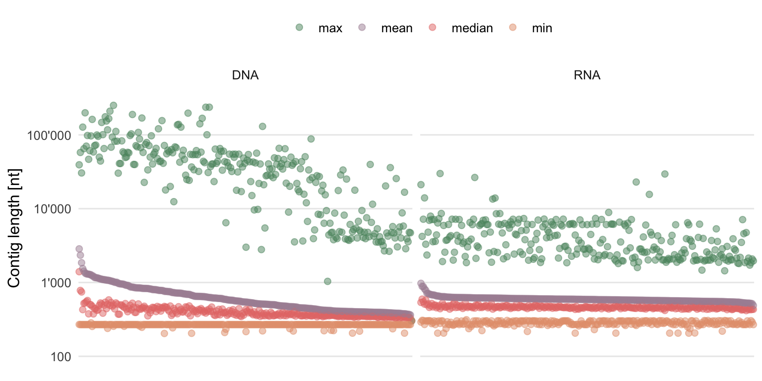
Figure 4.13: Summary statistics of the contig lengths. Each column contains the information of one sample, ordered by descending mean contig length.
While the longest contigs are often longer in DNA samples, there are also a lot of quite short contigs in DNA as well as RNA samples. The length distributions are heavy-tailed. Although not optimal due to general preference for longer contigs, this still shows that it was possible to create some quite long contigs with the chosen assembler and parameters, whereas the majority of the contigs remain relatively short.
If for some reason one would only be interested in the long contigs, the short ones could always be filtered out. However, this was not done for this approach, where all contigs, even the very short ones, were used.
To get an idea by how many reads (or in this case k-mers) the contigs are covered, Figure 4.14 shows the summary statistics of multi (roughly the average k-mer coverage) for the assembly of each sample.
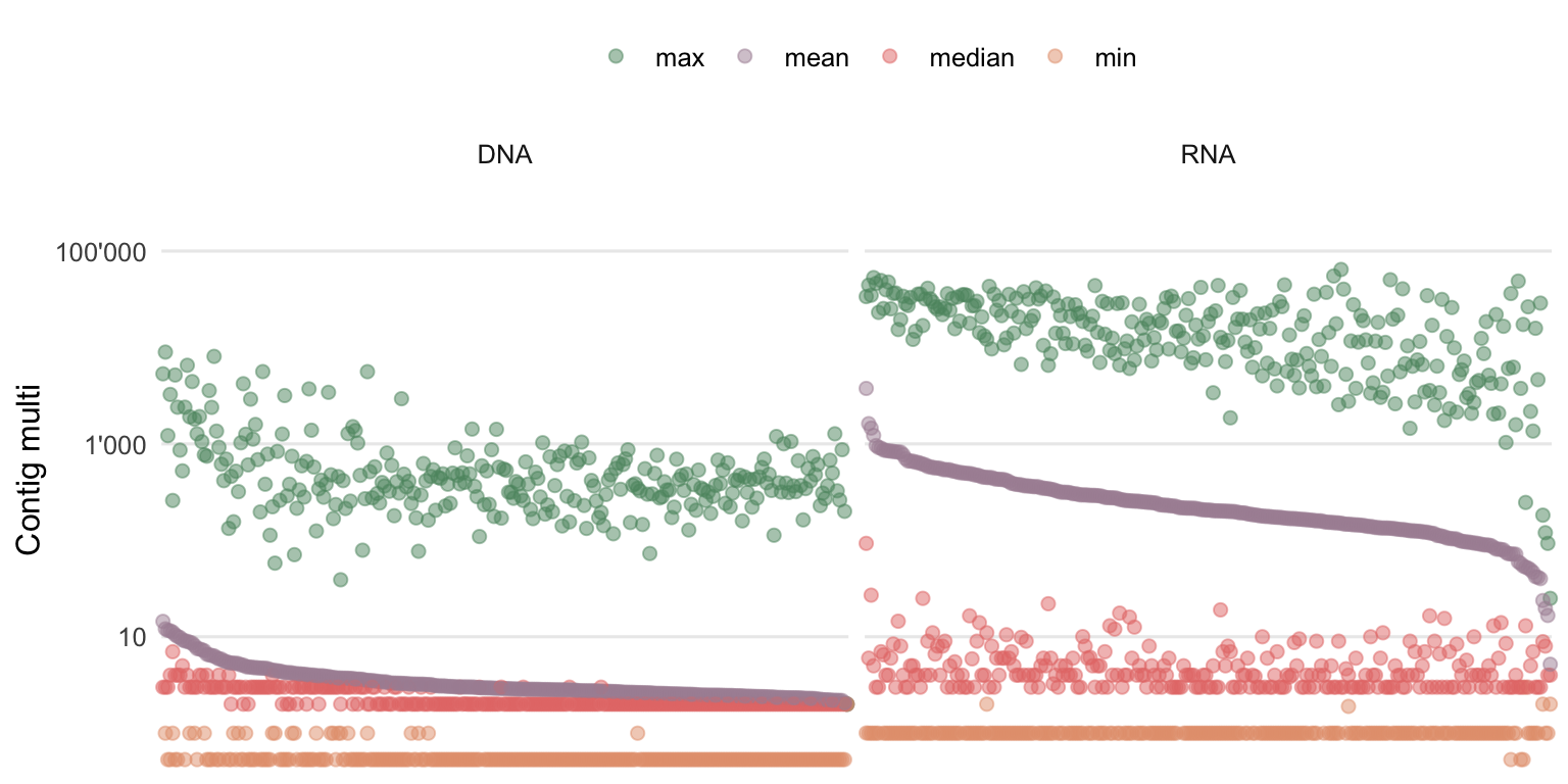
Figure 4.14: Summary statistics of the contig multi (roughly the average k-mer coverage). Each column contains the information of one sample, ordered by descending mean contig multi.
Contig multi seems to be negatively correlated with the number of contigs and contig lengths. Namely, the contigs of RNA samples are on average covered by more k-mers compared to the ones from DNA samples. This could suggest that while the RNA genomes or transcripts are shorter compared to the DNA genomes, they are also generally more abundant which leads to higher multis.
There is still, in both workflows, a lot of low covered contigs present which explains the low median multi observed. This is explained by the high diversity and comparatively low sequencing depth.
As it was suggested for the short contigs, there is also the option to remove low covered contigs if this is desired for the objective. For this semi-supervised approach, however, there was no minimum multi threshold defined and no contigs were removed.
4.3.2 Classifying contigs
In the next step (number 3 in Figure 3.4), the information from VirMet is combined with the outcome of the assembly. Since the assembly does not store the information which sequencing read is part of which contig, all raw reads were first mapped against the contigs. Then after it is known which reads (and their VirMet class label) belong to which contig, summary statistics can be done by e.g. listing the class proportions of all reads mapped to a specific contig.
Figure 4.15 shows these proportions on two toy examples in form of donut charts (basically circular stacked bar charts).
In order to classify the contigs, the class with the highest proportion (other than unclassified) is adopted. A minimum threshold for such a class label was defined at 5%. Meaning the class with the highest proportion (other than unclassified) has to be larger than 5%. This is a safety measure to reduce false classifications based on just a few classified reads, but at the same time to still label many contigs to get as much information out of this approach as possible. Depending on the objective, this threshold can either be increased or decreased.
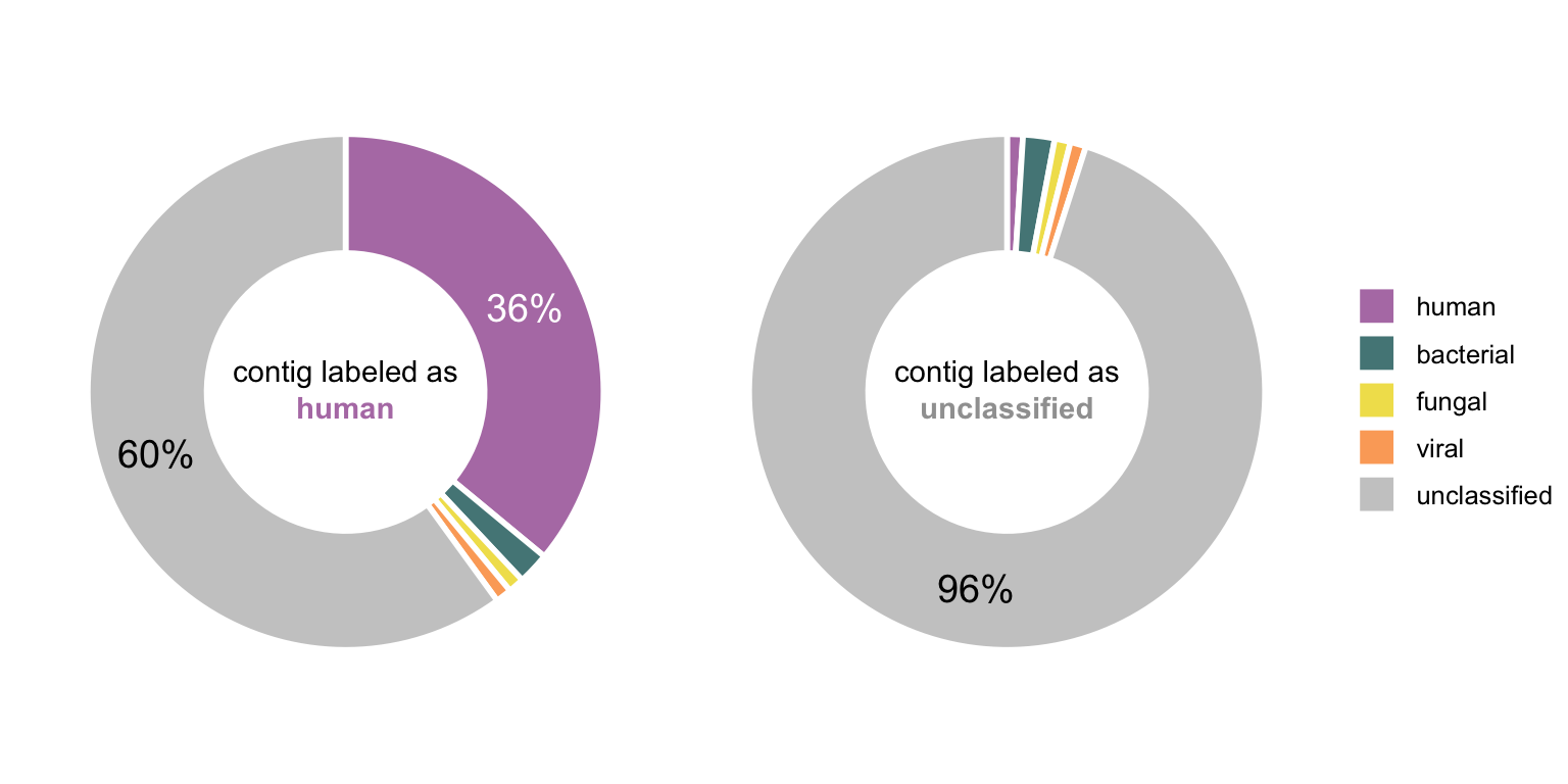
Figure 4.15: Two toy examples of a contig and the proportions of labeled reads mapped to it. In the first case, the highest non-unclassified fraction is human and it is >5% (where the threshold was set), hence the class of this contig would be human. Since the second contig consists mainly of unclassified reads and no other class exceeds the 5% threshold, would be labeled as unclassified.
Figure 4.16 shows how these proportions of the classes of mapped reads look like in a real sample. It shows all contigs from a selected RNA sample that have a multi of more than 2. The multi threshold was chosen to simplify the figure but was not applied for evaluating all the samples.
In this RNA sample, 763 reads from an Influenza A Virus genome were previously found (using VirMet). The eight viral contigs shown in Figure 4.16 are nearly the complete segments of this Influenza A Virus genome. It shows that even with a medium number of viral reads, the chosen way of doing the metagenome assembly was able to get contigs from all eight Influenza A Virus genome segments. Initial concerns about the possible low sensitivity of this approach could thus be partly calmed.
Another important point to observe was that it is usually clear to which class each contig belongs, meaning there is no indication of mixed contigs which consist of reads from different organisms. This could have still happened within the chosen classes (e.g. chimeric bacterial contigs) but that would not affect the implementation at hand.
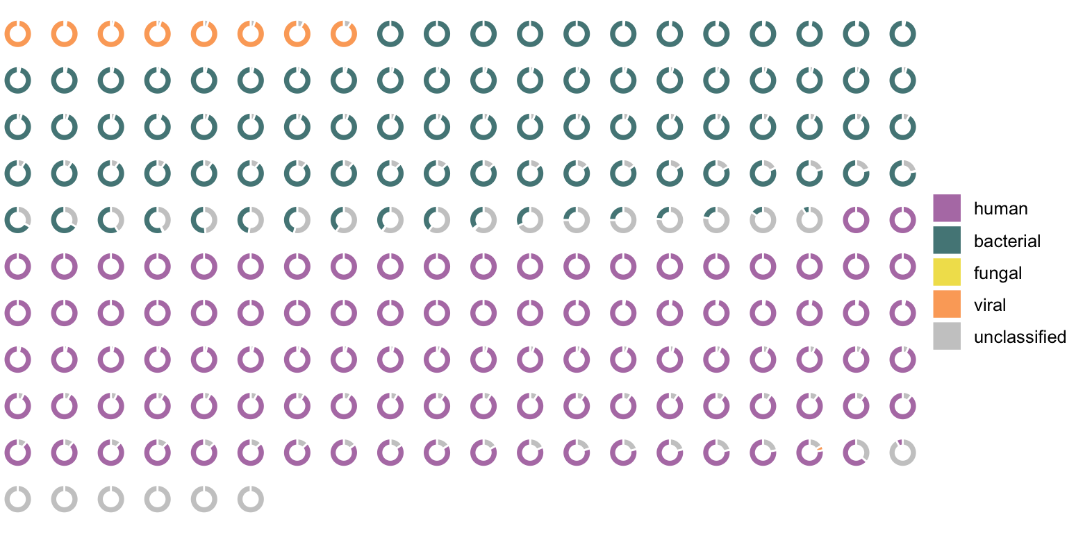
Figure 4.16: Each ring represents one contig from an RNA sample which was Influenza A Virus positive (the eight genome segments could be assembled). The colors show the proportion of classified reads mapped to the contigs.
4.3.3 Infering class labels of previously unclassified reads
In the final step (number 4 in Figure 3.4) the unclassified reads which were mapped to a classified contig adopt the same class label as the contig.
The class composition of the previously unclassified reads, which is the main question of this thesis, is shown in Figures 4.17 and 4.18 for DNA and RNA, respectively.
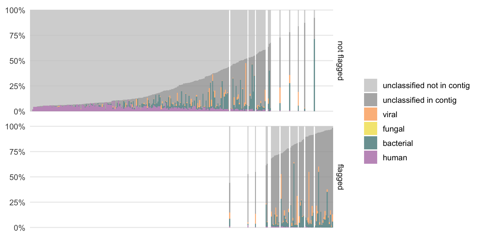
Figure 4.17: Distribution of previously unclassified reads from DNA samples into the different classes. Each bar represents the result of one sample. The samples are ordered by the fraction of unclassified reads which are not part of a contig. The colors represent the newly added class designations. The gray parts are the proportions of reads that remain without a class label. Samples that were previously flagged as potentially interesting, using the linear regression approach, are shown separately to identify a possible pattern.
There is still a fraction of reads which could not be classified (gray portion) which is larger in the DNA compared to the RNA samples. The remaining unclassified reads are divided into two subclasses, the reads which are not part of a contig and those which are part of a larger contig that could not be classified.
While we cannot do much more with the first subclass (“unclassified not in contig”), the second subclass (“unclassified in contig”) is particularly interesting as it could harbor contigs from not yet characterized organisms (or organisms which are not part of the reference databases used, e.g. parasites in this case).
Particularly in the DNA samples, this fraction of “unclassified in contig” reads is the highest among the samples previously flagged as potentially interesting (see Section 4.1.2). This reinforces the assumption that this method could be useful to label potentially interesting samples.
The additionally classified reads cover all four classes (human, bacterial, fungal, and viral). The distributions of these differ from sample to sample. This suggests that it is not an issue with one particular class only since reads from all classes could be additionally labeled using this semi-supervised approach.
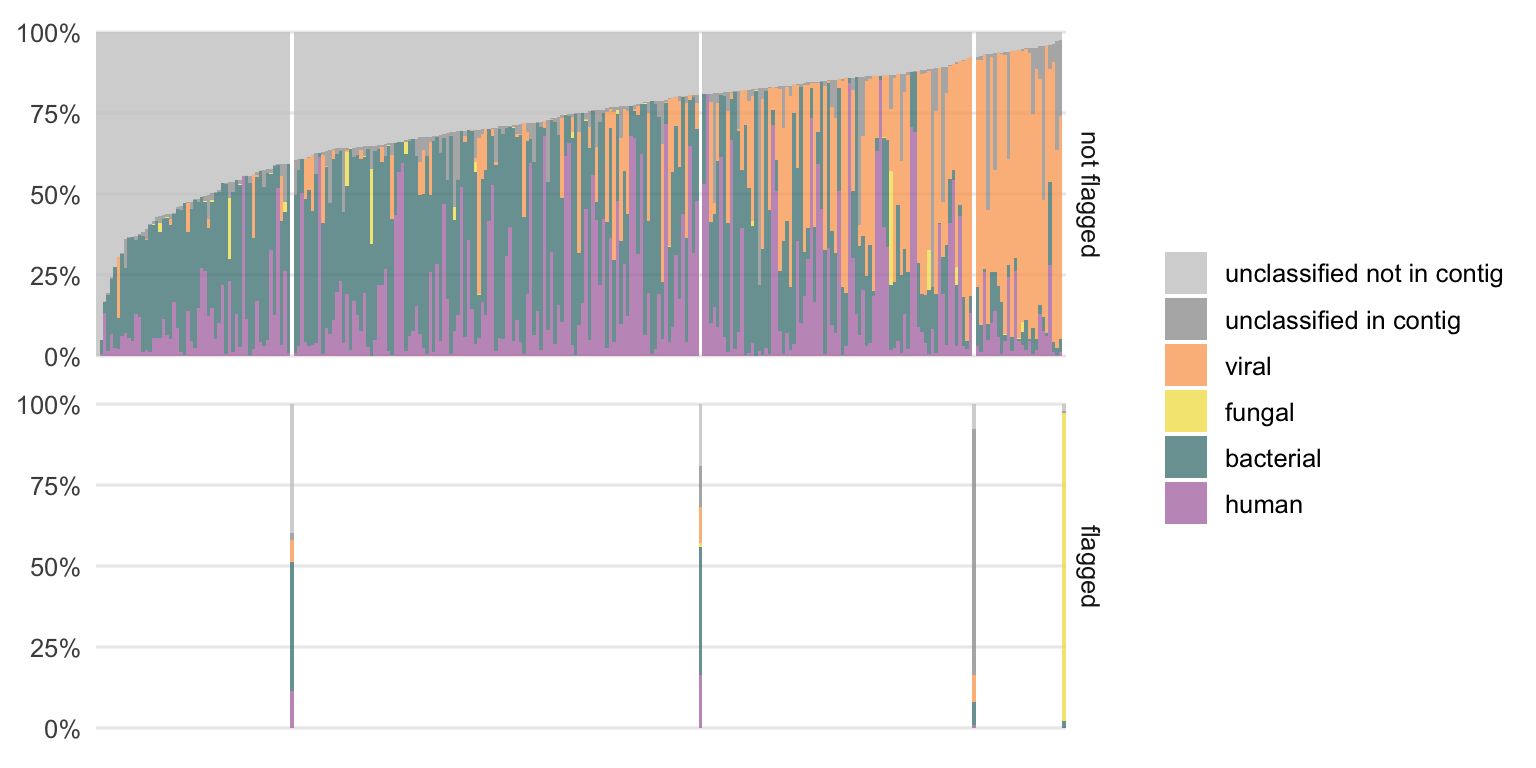
Figure 4.18: Same type of plot as the previous figure but for all RNA samples.
To gain a brief insight into the overall result, Figure 4.19 shows the average proportions of Figures 4.17 and 4.18. With this semi-supervised approach, 10.8% of all previously unclassified DNA reads and 67.7% of all previously unclassified RNA reads could be classified.
It is not yet clear what causes the different performance and outcomes between the DNA and RNA workflow. This would require further investigation, which is out of the scope of this thesis.
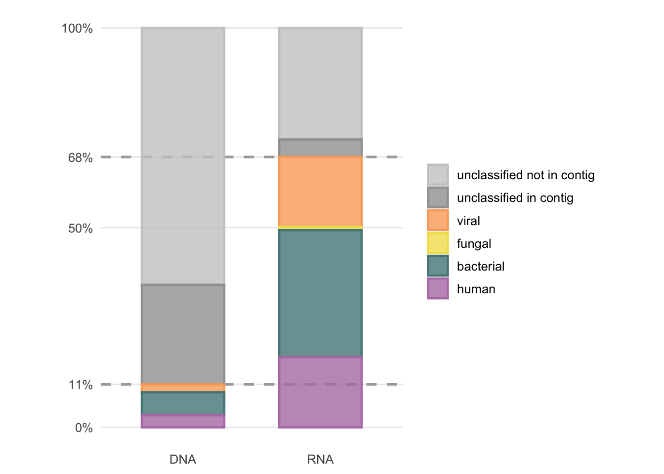
Figure 4.19: Average fractions of previously unclassified reads after the second round of classification by the semi-supervised approach.
If there was a bias towards one particular class (e.g. let us assume bacterial reads remain more often unclassified compared to reads from other classes) one would be able to detect this by comparing the class distributions to the class proportions from VirMet (Figures 3.2 and 3.3). The average proportions are compared in Figure 4.20.
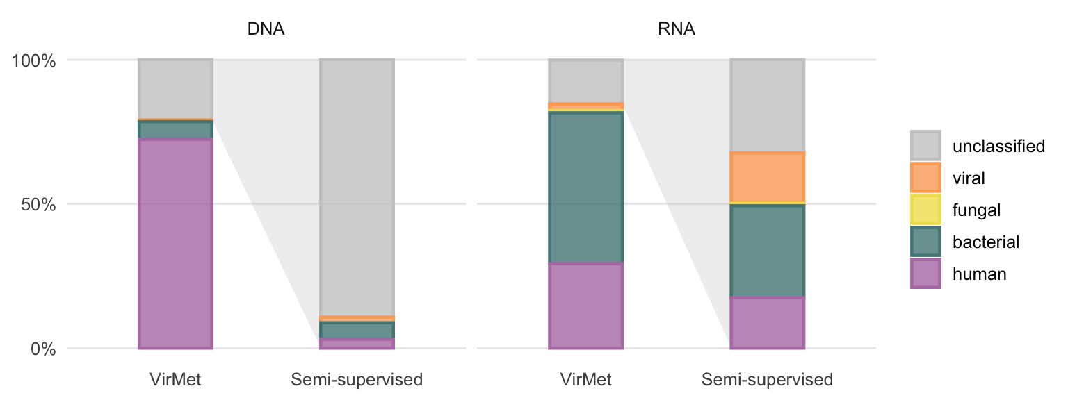
Figure 4.20: VirMet class label proportions compared to the average fractions of previously unclassified reads after the semi-supervised approach. The light grey polygon between the bars highlights that the semi-supervised bars show the proportion of all previously (using VirMet) unclassified reads.
A more detailed comparison of the differences in proportions per sample is shown in Figure 4.21. The largest differences when comparing the VirMet and semi-supervised class label proportion can be observed between the unclassified and the human and viral class for DNA and RNA samples, respectively.
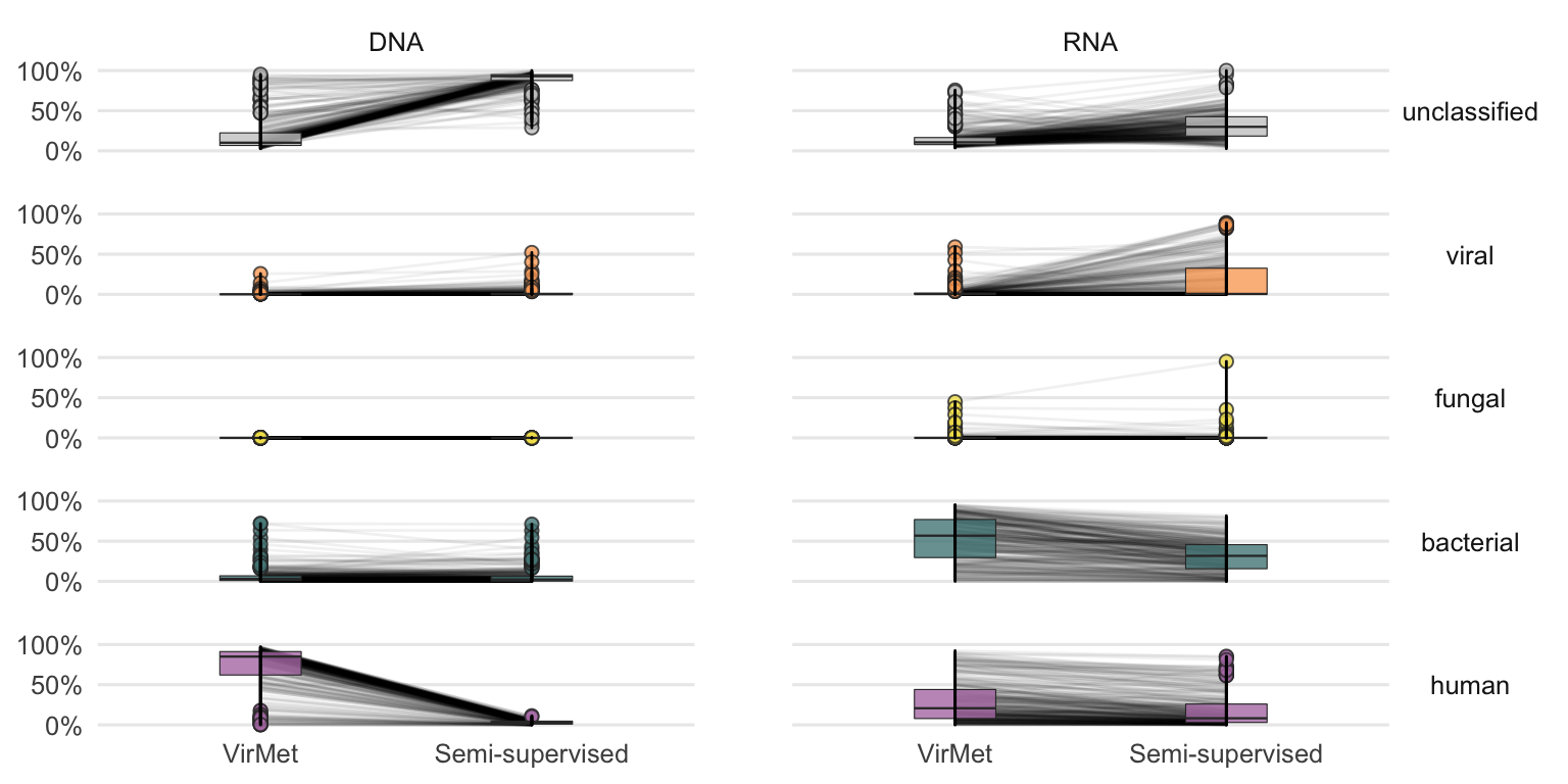
Figure 4.21: Detailed comparison between VirMet and semi-supervised proportions for each sample. The lines between the boxplots connect the same sample.
4.3.4 Revisiting quality comparison
The conclusion from the comparison of the Q30 rate between the classified and unclassified sequencing reads (Section 4.2.1) was that the unclassified reads exhibit significantly lower quality. It was however not clear if the lower quality was the cause or the effect of the inability to be classified.
After the metagenome assembly, the same Figure (4.8) can be recreated but the unclassified part can be further divided into “unclassified not in contig” and “unclassified in contig”.
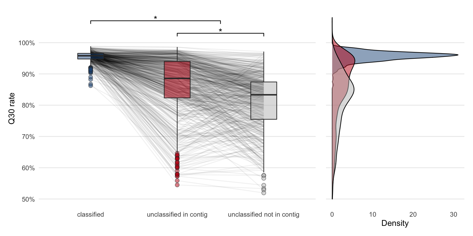
Figure 4.22: Comparing Q30 rates of sequencing reads from different classes (same as previous Q30 rate figure). The only difference is that the unclassified group is further divided based on whether the reads are part of a contig or not.
Dividing the group of unclassified reads further shows that in most of the samples the quality of the reads forming a contig is higher compared to those which are not part of a contig. Once again, from this data alone it is not possible to conclude whether the unclassified reads are not part of a contig due to lower quality or due to a possible (but unidentified) confounding variable.
To test if the Q30 rate difference between any of the three groups is significant, a Kruskal-Wallis rank sum test was performed (\(p = 2.8\times 10^{-190}\)). A pairwise Wilcoxon test with the Benjamini and Hochberg method54 for adjusting the p-values revealed a significant difference between all three groups (Table 4.2).
| Group 1 | Group 2 | p-value |
|---|---|---|
| unclassified in contig | classified | 1.8e-97 |
| unclassified not in contig | classified | 1.8e-168 |
| unclassified not in contig | unclassified in contig | 8.2e-25 |
4.3.5 Metagenome binning
The attempt of binning contigs from the same organisms using MetaBAT 255 failed. A preliminary test resulted in mainly unbinned contigs or bins with just a single contig. The likely reason is that there are many short contigs (<1’500 bp) which have to be excluded.
To try to further bin the metagenome contigs may not be worth in this context using this dataset. Partially because binning could introduce even more possibilities for error by creating mixed bins.
However, it may be useful for some specific samples where a large fraction is undetermined and many contigs (possibly from the same organism) are formed.
References
15. Chen, S., Zhou, Y., Chen, Y. & Gu, J. Fastp: An ultra-fast all-in-one FASTQ preprocessor. Bioinformatics 34, i884–i890 (2018).
24. Li, D., Liu, C.-M., Luo, R., Sadakane, K. & Lam, T.-W. MEGAHIT: An ultra-fast single-node solution for large and complex metagenomics assembly via succinct de Bruijn graph. Bioinformatics (Oxford, England) 31, 1674–1676 (2015).
54. Benjamini, Y. & Hochberg, Y. Controlling the False Discovery Rate: A Practical and Powerful Approach to Multiple Testing. Journal of the Royal Statistical Society: Series B (Methodological) 57, 289–300 (1995).
55. Kang, D. D. et al. MetaBAT 2: An adaptive binning algorithm for robust and efficient genome reconstruction from metagenome assemblies. PeerJ 7, (2019).